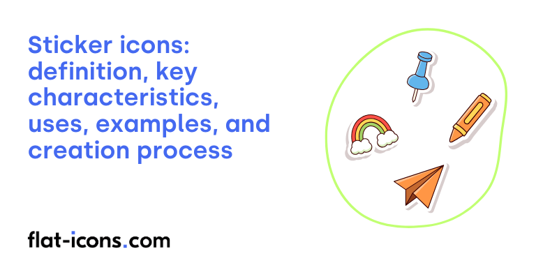
Sticker icons are digital icons that resemble physical stickers, often featuring an outline and a slight shadow to suggest they are adhered to a surface.
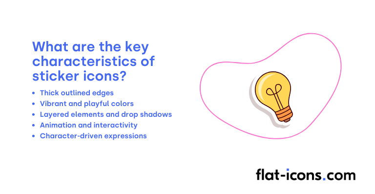
The key characteristics of sticker icons are thick outlined edges, vibrant and playful colors, layered elements and drop shadows, animation and interactivity, and character-driven expressions.
Sticker icons are typically used in chat applications, online communication, social media messaging apps, mobile operating system messaging apps, photo and video sharing platforms, and websites.
Table of Contents
What are sticker icons?
Sticker icons are graphical symbols designed to look like physical stickers, often including an outline and a shadow effect. These icons aim to capture the feel of traditional stickers, providing a fun and emotionally engaging way to convey messages and sentiments digitally.
This icon style frequently brings about a sense of nostalgia, recalling childhood sticker books and adding a touch of familiarity and lightheartedness to digital projects.
In comparison to emojis, sticker icons can be seen as a more detailed and flexible form of visual communication. While emojis are usually fixed graphic illustrations determined by the platform, stickers can encompass a wider variety of visual styles.
Furthermore, sticker icons have the capacity to communicate more intricate messages, potentially including full sentences or phrases.
What are the key characteristics of sticker icons?

The key characteristics of sticker icons are listed below.
- Thick outlined edges: Often feature a prominent, frequently white, outline that mimics the border of a physical sticker.
- Vibrant and playful colors: Typically use bright and diverse color palettes, sometimes with intentional clashes to create a playful effect.
- Layered elements and drop shadows: Common use of overlapping elements and drop shadows adds depth and a sense of separation from the background.
- Animation and interactivity: Some sticker icons include dynamic features like peeling animations or zooming effects to enhance engagement.
- Character-driven expressions: Many sticker icons portray characters with distinct facial expressions and body language to convey emotions or messages.
Where are sticker icons typically used?
Sticker icons are typically used as listed below.
- Chat applications (e.g., Line, KakaoTalk): Prominently used for expressive communication, where they were initially popularized as a key feature.
- Online communication (professional and general): Extend beyond casual chats to enhance communication in various online settings.
- Social media messaging apps (e.g., Facebook, WhatsApp): Widely adopted as a ubiquitous element for adding personality and emotion to online interactions.
- Mobile operating system messaging apps (e.g., iOS Messages): Integrated into native messaging apps, offering a variety of sticker packs for richer communication.
- Photo and video sharing platforms (e.g., Instagram, Snapchat): Used to enhance visual storytelling and personal expression by adding digital stickers to media.
- Websites: Increasingly being incorporated as navigational cues, buttons, or other design components to add visual interest and engagement.
When should you use sticker icons?
You should use sticker icons particularly to add fun and emotion to conversations, conveying messages in a lighthearted manner and expressing feelings or thoughts more effectively than text alone. When words alone struggle to capture a particular mood or complex emotion, a well-chosen sticker can often bridge that gap.
They offer a convenient and immediate way to convey ideas or emotions without the need for lengthy text, making communication faster and more engaging for users.
For brands and marketers, sticker icons present a valuable opportunity to stand out, increase brand awareness, and connect with audiences, especially younger demographics, through authentic and amusing visual content.
What are the pros and cons of using sticker icons?
The pros of using sticker icons are listed below.
- Improve expressiveness and inject personality: Sticker icons effectively convey emotions and add fun to online interactions.
- Simplify communication and improve user experience: They can make complex ideas easier to understand and enhance digital interfaces.
- Potential for marketing and branding: They offer a chance for viral spread and help brands stand out, particularly with younger audiences, through engaging content.
- Bridge language barriers: Their visual nature can make communication more accessible across different languages.
The cons of using sticker icons are listed below.
- Limited customization and scalability: Often in raster format (like PNG), they lack the flexibility of vector graphics for extensive customization and scaling without loss of quality.
- Risk of clutter and unprofessionalism: Overusing sticker icons can make communication appear cluttered and potentially unprofessional in formal contexts.
- Potential for ambiguous interpretation: The meaning of sticker icons can sometimes be unclear, leading to misunderstandings.
What are some examples of sticker icons?
Some examples of sticker icons are listed below.
- A speech bubble with a dashed outline: Resembling a sticker that has been partially peeled off, revealing a dotted line where it was attached.
- A heart shape with a white border: Giving the icon the appearance of a die-cut sticker with a distinct white edge.
- A star icon with a slight shadow underneath: Creating the illusion that the star is raised slightly off the surface, like a physical sticker.
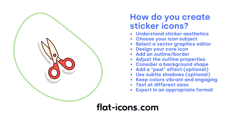
How do you create sticker icons?

You create sticker icons by following the step-by-step guide below.
- Understand sticker aesthetics: Sticker icons often have a distinct look that mimics physical stickers. This typically includes a prominent outline or border that suggests the icon is a separate layer applied to a surface. They can also feature vibrant colors and sometimes a slight “peel” effect.
- Choose your icon subject: Decide what your sticker icon will represent. Opt for a clear and simple design that will be easily recognizable even with the added sticker elements.
- Select a vector graphics editor: Use a vector-based software like Adobe Illustrator, Sketch, Figma, or Inkscape. Vector format is ideal for sticker icons as it allows for scalability and clean outlines.
- Design your core icon: Start by creating the main visual element of your icon. This could be a simplified version of an object, a symbol, or a letter.
- Add an outline/border: This is the defining feature of a sticker icon. Create a stroke around your core icon shape. Make sure the stroke is thick enough to be clearly visible.
- Adjust the outline properties: Customize the appearance of your outline. You can choose the color (often white or a contrasting color), the thickness, and the corner style (round or sharp). A rounded corner often enhances the sticker look.
- Consider a background shape (optional): You might want to place your core icon and its outline on a solid background shape, such as a circle, square, or speech bubble. This can further emphasize the sticker effect.
- Add a “peel” effect (optional): To make your icon look even more like a real sticker, you can add a small “peel” effect to one of the corners. This involves creating a small, folded-over triangle shape that appears to be lifting off the surface, revealing a shadow underneath.
- Use subtle shadows (optional): Adding a subtle drop shadow beneath the main icon and the outline can enhance the feeling that the sticker is slightly raised from the surface.
- Keep colors vibrant and engaging: Stickers are often colorful and eye-catching. Choose a color palette that is bright and appealing for your core icon and its background (if you’re using one).
- Test at different sizes: Once you’ve created your sticker icon, view it at various sizes to ensure that the outline and other details remain clear and legible. Adjust the stroke thickness if necessary.
- Export in an appropriate format: Export your sticker icon in a format that supports transparency if you want it to be placed on various backgrounds. PNG is a common choice for raster images with transparency, while SVG is excellent for vector graphics that need to be scalable.
Read more icon articles
