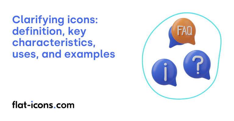
Clarifying icons are digital icons that are used to visually represent and explain information, functions, or states within a user interface, enhancing user understanding.
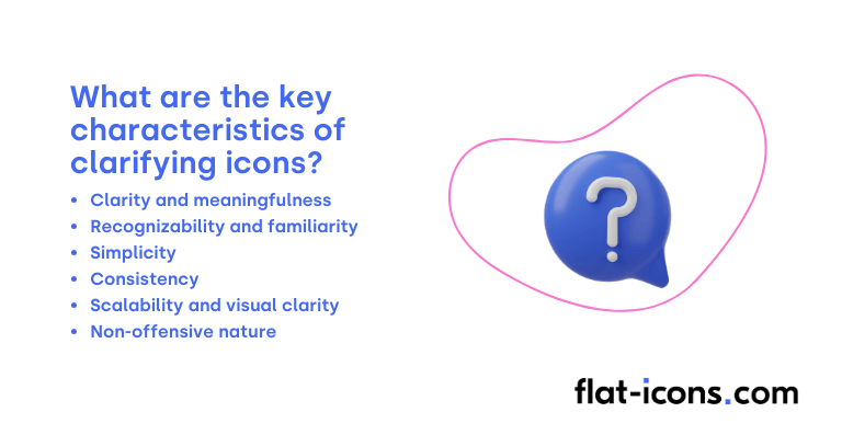
The key characteristics of clarifying icons are clarity and meaningfulness, recognizability and familiarity, simplicity, consistency, scalability and visual clarity, and non-offensive nature.
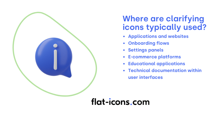
Clarifying icons are typically used in applications and websites, onboarding flows, settings panels, e-commerce platforms, educational applications, and technical documentation within user interfaces.
Table of Contents
What are clarifying icons?
Clarifying icons are visual markers specifically designed to explain particular features or content categories within a user interface. These icons often incorporate a combination of illustrative elements along with brief explanatory text and, in some cases, a button to provide further interaction.
A significant characteristic of clarifying icons is that they are generally not interactive elements on their own. Instead, their primary function is to engage multiple aspects of the user’s perception, offering richer context and ultimately leading to improved understanding of the interface, forming an additional icon category.
Essentially, clarifying icons act as visual annotations within the user interface. They serve to support the user’s comprehension of the functionalities available or the type of content being presented, making the interface more intuitive and easier to navigate.
What are the key characteristics of clarifying icons?

The key characteristics of clarifying icons are listed below.
- Clarity and meaningfulness: The primary characteristic is that the icon’s meaning should be readily understandable and clearly convey the function or content it represents.
- Recognizability and familiarity: Users should be able to easily recognize and correctly interpret the icon, often through the use of familiar symbols and visual metaphors.
- Simplicity: Effective clarifying icons avoid unnecessary graphic details to ensure quick perception and understanding.
- Consistency: The icon’s style should be consistent with the overall visual language of the user interface to create a unified experience.
- Scalability and visual clarity: Icons must maintain their legibility and integrity across various sizes and resolutions to be effective in different contexts.
- Non-offensive nature: The icon should be free from any hidden meanings or potential misinterpretations that could be considered inappropriate or confusing to users.
Where are clarifying icons typically used?

Clarifying icons are typically used as listed below.
- Applications and websites: Commonly used to explain features or highlight content categories, often placed alongside explanatory text and buttons for immediate visual context.
- Onboarding flows: Utilized to visually introduce new users to application functionalities, making the initial experience more intuitive and less overwhelming.
- Settings panels: Integrated to help users understand configuration options, providing visual cues for different settings and their purposes.
- E-commerce platforms: Employed to draw attention to product features or benefits, like “eco-friendly” or “fast shipping,” enhancing product understanding and potentially increasing sales.
- Educational applications: Used to visually represent abstract concepts or guide students through learning materials, making complex information more accessible and engaging.
- Technical documentation within user interfaces: Integrated to complement textual explanations, providing visual aids to clarify instructions or technical details.
When should you use clarifying icons?
You should use clarifying icons primarily to explain specific features or to clearly delineate different categories of content within your user interface. Their effectiveness is significantly enhanced when they are used in conjunction with short pieces of explanatory text that reinforce their intended meaning. This combination of visual and textual cues engages multiple aspects of user perception, leading to improved comprehension.
Clarifying icons are particularly valuable when a visual representation can convey information more quickly or effectively than text alone. They also provide crucial support for users who may experience difficulties with text recognition, contributing to a more inclusive and accessible design. Furthermore, these icons can effectively guide users when you are introducing unique or less common features that might not be immediately intuitive.
It is important to pair clarifying icons with words, especially when the icons themselves are not universally recognized, as relying solely on visuals in such cases can lead to ambiguity and user frustration. Supplementing clarifying icons with concise text labels or tooltips ensures clarity and accessibility for a broader range of users, particularly when dealing with niche or product-specific functionalities.
What are the pros and cons of using clarifying icons?
The pros of using clarifying icons are listed below.
- Enhanced recognition and faster understanding: Combining icons with text improves feature recognition and can lead to quicker comprehension for some users.
- Improved accessibility and reduced misunderstanding: Provides an alternative for users with text recognition difficulties and minimizes the chances of misinterpreting functionality.
- Enhanced user experience and navigation: Offers intuitive visual guidance, making the interface more user-friendly and easier to navigate.
- Space efficiency and multilingual understanding: Can potentially replace longer text, saving screen space, and icons can aid understanding across different languages.
The cons of using clarifying icons are listed below.
- Potential for visual clutter and misinterpretation: Too many or poorly designed clarifying icons can overwhelm users and lead to confusion instead of clarity.
- Increased screen real estate usage: Pairing icons with text can take up more space, which can be problematic in interfaces with limited room.
- Risk of conflicting interpretations: Different user groups may understand icons differently based on their background and experiences.
- Dependence on careful design and testing: Effective use requires a thorough understanding of the target audience and user testing to ensure correct interpretation.
What are some examples of clarifying icons?
Some examples of clarifying icons are listed below.
- Lightbulb icon in a smart home app: Explains the functionality to control lights.
- Lock icon for security features: Clearly indicates options related to locking or securing something.
- House, apartment, or hotel icons: Represent different types of accommodation.
- Gear icon: Represents settings or configuration options.
- Pencil icon: Signifies the action of editing or modifying content.
- Magnifying glass paired with text “Search”: Clarifies the button’s function to initiate a search.
- Two crossed wrenches: Explains that an area or function is related to maintenance or engineering.
- Clam icon: Denotes the action of compression (zipping files).
- Document icon with a plus sign: Clarifies the option to create a new document.
- Shopping bag icon: Clearly represents a section or function related to shopping or products for sale.
Read more icon articles
