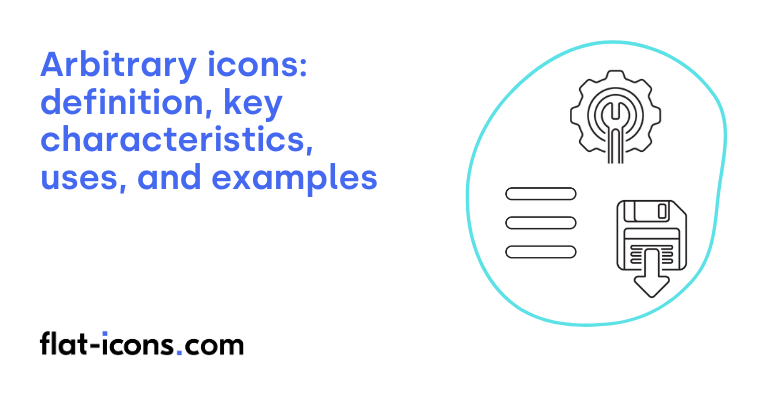
Arbitrary icons are digital icons that lack a clear or logical visual connection to the function or concept they represent, making their meaning less intuitive for users.
The key characteristics of arbitrary icons are lack of inherent resemblance, meaning dependent on convention, abstract or symbolic in nature, and requirement for learning and memorization.
Arbitrary icons are typically used in navigation menus, system controls and settings, abstract actions or concepts, and industry standards.
Table of Contents
What are arbitrary icons?
Arbitrary icons are visual symbols whose meaning is not directly suggested by their form. Instead of inherently representing the object, action, or concept they signify, the meaning of these icons is developed through repeated exposure and learned association by users. Consequently, the ability to recognize and understand these icons depends heavily on established conventions and user habits.
From a semiotic viewpoint, arbitrary icons share similarities with what are known as “symbols”, representing an additional icon category. Ferdinand de Saussure’s theory of the sign posits an arbitrary relationship between the signifier, which in this case is the icon’s visual appearance, and the signified, which is the concept it represents. This implies that the connection between the icon’s form and its meaning is based on social agreement rather than any inherent or natural link.
Building on this, Charles Sanders Peirce, another prominent figure in semiotics, also categorized signs, and arbitrary icons would fall under his category of “symbols.” In this framework, the relationship between the sign (the icon) and its object (what it represents) is also understood to be conventional and acquired through learning.
What are the key characteristics of arbitrary icons?

The key characteristics of arbitrary icons are listed below.
- Lack of inherent resemblance: Arbitrary icons do not visually resemble the object, action, or concept they represent.
- Meaning dependent on convention: Their meaning relies entirely on convention, agreement, and repeated exposure.
- Abstract or symbolic in nature: These icons often employ simplified geometric shapes or stylized forms.
- Requirement for learning and memorization: Users must learn and memorize their function, which can be a barrier for new users.
Where are arbitrary icons typically used?

Arbitrary icons are typically used as listed below.
- Navigation menus: Frequently used to represent different sections or functions, especially in mobile interfaces where space is limited.
- System controls and settings: Commonly used for system-level actions and settings, such as power buttons, WiFi symbols, and Bluetooth icons, due to their established recognition.
- Abstract actions or concepts: Within applications, they represent abstract actions or concepts like “share,” “sync,” or “refresh,” providing a visual shorthand for these functionalities.
- Industry standards: Used when representing industry standards that have become widely recognized over time, like the floppy disk icon for “save,” leveraging established user understanding.
When should you use arbitrary icons?
You should use arbitrary icons primarily when you need to represent abstract actions or concepts that do not have a clear or direct visual representation in the real world. These icons rely on learned associations and conventions rather than direct resemblance.
Arbitrary icons can also be suitable when you are aiming for a minimalist aesthetic in your design or when you are working with limited screen space, provided that the meaning of the icons is well-established and understood by your target audience.
For common and frequently used functions, it is generally beneficial to use recognized symbols to enhance usability. Ultimately, the decision to use arbitrary icons should always prioritize clarity and ensure that users can easily understand their intended meaning within the context of your interface.
What are the pros and cons of using arbitrary icons?
The pros of using arbitrary icons are listed below.
- Space efficiency: They can represent complex functions in a compact form, which is valuable in interfaces with limited space.
- Aesthetic flexibility and brand reinforcement: Their abstract nature allows for creative freedom in developing a unique visual aesthetic that can strongly reinforce brand identity.
- Potential for language independence and representation of abstract concepts: Once users learn their meaning, they can potentially overcome language barriers and effectively represent actions or ideas without direct visual counterparts.
The cons of using arbitrary icons are listed below.
- High learning curve and reduced intuitiveness: Users must learn and remember the meaning of these icons, making interfaces less intuitive and potentially harder for new users to navigate.
- Potential for ambiguity and misinterpretation: Without inherent visual cues, arbitrary icons are susceptible to being misunderstood, leading to user errors and frustration.
- Dependence on context and necessity of text labels: Their meaning can be highly specific to a particular context, and often accompanying text labels are required to ensure clarity, which can negate some of the space-saving benefits.
- Accessibility challenges: Their lack of inherent meaning can make interfaces more difficult to understand and navigate for users with cognitive disabilities or those unfamiliar with the specific icon set.
What are some examples of arbitrary icons?
Some examples of arbitrary icons are listed below.
- Hamburger menu (☰): Represents a menu or navigation options.
- Floppy disk: Represents the action of saving data.
- Power button (◯ with a line or |): Symbol for turning a device on or off.
- Wi-Fi symbol (curved lines radiating upwards): Represents wireless internet connectivity.
- Share icon (three connected dots or an upward-pointing arrow): Indicates the function of sharing content.
- Sync icon (two arrows forming a circle): Represents synchronizing data.
- Question mark (?): Denotes “help” or access to assistance.
- Exclamation point (!): Indicates an alert, warning, or important information.
- Plus sign (+): Represents adding a new item or expanding a section.
- Minus sign (-): Represents subtracting, removing, or collapsing an item.
Read more icon articles
