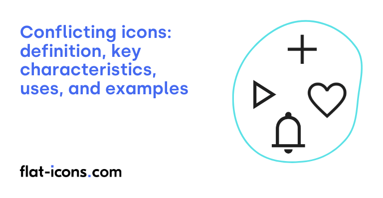
Conflicting icons are digital icons that exhibit visual or semantic inconsistencies within a user interface or icon set, potentially leading to user confusion or misinterpretation.
The key characteristics of conflicting icons are context dependence, potential for misinterpretation, equally recognizable alternatives, lack of universal standard, and increased cognitive load.
Conflicting icons are typically used in social media platforms, e-commerce websites, various apps and websites, and platform-specific conventions.
Table of Contents
What are conflicting icons?
Conflicting icons are visual symbols that suffer from inconsistencies in their representation or interpretation. This can manifest in two main ways: either a single concept is represented by multiple different visual forms, or a single visual form carries different meanings depending on the specific platform or the context in which it is used. The defining trait of these icons is the lack of a universally understood meaning across various digital environments.
This inconsistency in interpretation can lead to user confusion and frustration, as the expected action or meaning associated with an icon on one platform might be entirely different on another, thus representing an additional icon category of problematic symbols.
What are the key characteristics of conflicting icons?

The key characteristics of conflicting icons are listed below.
- Context dependence: The meaning and interpretation of a conflicting icon vary significantly depending on the specific platform, application, or area within an interface where it is used.
- Potential for misinterpretation: Users may incorrectly assume an icon has the same function across different contexts, leading to confusion and a negative user experience.
- Equally recognizable alternatives: Conflicting icons often represent the same function with multiple visual symbols that are widely understood but not universally standardized.
- Lack of universal standard: The absence of a single, universally accepted visual representation for certain actions or concepts leads to the existence of conflicting icon conventions.
- Increased cognitive load: Users encountering conflicting icons may experience an increased cognitive load as they need to learn and remember different meanings for the same visual symbol in different environments.
Where are conflicting icons typically used?

Conflicting icons are typically used as listed below.
- Social media platforms: Icons for common actions like “like,” “share,” and “save” often vary in visual representation between platforms such as Facebook, Instagram, and Twitter.
- E-commerce websites: Conflicting icons are frequently seen, especially for features like saving items, where both heart and star icons are commonly used to represent “wishlist” or “favorites.”
- Various apps and websites: Different icons are often used for the same action, such as the “share” function, which might be represented by a curved arrow or three connected dots depending on the interface.
- Platform-specific conventions: Different operating systems and design languages may favor certain icons for particular functions, leading to inconsistencies across platforms.
When should you use conflicting icons?
Generally, you should avoid using icons with conflicting meanings within the same user interface, as most design principles advise against this practice due to the potential for user confusion. However, in the rare instance where a conflicting icon is used, it is absolutely crucial to maintain strict consistency in its application throughout the entire product to minimize ambiguity.
If you do choose to use a conflicting icon, it is highly recommended to always accompany it with clear and concise text labels to explicitly define its meaning within the specific context. Designers should also carefully consider their target audience, as users who are very familiar with the conventions of a particular platform might have an existing understanding of an icon that differs from its intended use in your product. Ensuring contextual clarity within the interface itself can also aid users in understanding the intended meaning of a potentially conflicting icon.
What are the pros and cons of using conflicting icons?
The pros of using conflicting icons are listed below.
- Potential familiarity for users of specific platforms: Users who are accustomed to a particular platform might recognize a conflicting icon and understand its intended meaning in a new context.
The cons of using conflicting icons are listed below.
- Confusion and misinterpretation: Conflicting icons can lead users to make incorrect assumptions about their function, especially for those unfamiliar with the specific icon’s original meaning.
- Inconsistent user experience and increased cognitive load: Using icons with unexpected meanings creates a disjointed experience and forces users to spend more effort understanding the interface.
- Discourages reliance on icons: When icons frequently have surprising meanings, users may become hesitant to trust them for navigation or interaction.
What are some examples of conflicting icons?
Some examples of conflicting icons are listed below.
- “Like” function: Represented by a thumbs-up on Facebook, a heart on Instagram and Twitter, and a star on other platforms for “favorite” or “bookmark”.
- “Share” function: Depicted as a curved arrow on some platforms, while three connected circles or dots are used on others.
- “Save” function: Historically shown as a floppy disk, but increasingly represented by a bookmark icon, and even a heart for “save to wishlist” on some sites.
- “Close” or “No” vs. “Yes” or “Completed”: An “X” mark typically means “close” or “no” in many Western contexts, but can represent “yes” or “completed” in some other cultures.
- “Back” navigation: Generally understood as a left-pointing arrow, but the hamburger menu was once used by Google Docs for this action, causing confusion.
- Play button variations: While generally a right-pointing triangle, some platforms might use different shapes or orientations.
- Mute icon variations: Sometimes shown as a speaker with a slash, other times as a speaker with no sound waves.
- Location marker styles: Can be a teardrop shape, a circular pin, or other variations, potentially causing slight confusion for users unfamiliar with a specific style.
- Notification badge placement: The visual cue for new notifications (e.g., a red dot) might appear in different corners or positions on an icon across various apps.
- “Add to cart” icon: While often a shopping cart, some sites might use a plus sign or a bag icon, leading to slight inconsistencies.
Read more icon articles
