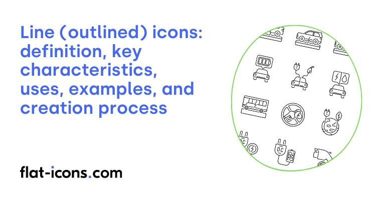
Line icons are digital icons that utilize thin outlines or strokes to define their shape, lacking filled areas.
The key characteristics of line icons are stroke weight, monochromatic color, outline shape, consistent size and alignment, variable complexity, and corner and stroke end style.
Line icons are typically used in websites and web applications, mobile applications, control centers and dashboards, print and marketing materials, and physical environments.
Table of Contents
What are line (outlined) icons?
Line icons are symbolic glyphs defined by their outlines, typically rendered in a single color without any fill. Also known as “stroke” or “contour” icons, they emphasize the essential shape of an object or action for quick visual recognition.
Their minimalist aesthetic, a key characteristic of this icon style, can range from simple outlines to more detailed designs, sometimes including dimensional aspects like isometric perspectives. This focus on the outline reduces visual noise, allowing users to easily identify familiar shapes and their meanings.
The versatility of line icons is a key benefit, as they can adapt to various design styles and levels of detail needed for different projects, while always prioritizing clarity and efficiency in conveying information.
What are the key characteristics of line (outlined) icons?

The key characteristics of line icons are listed below.
- Stroke weight: The thickness of the lines forming the icon can be adjusted to establish visual hierarchy and ensure consistency.
- Monochromatic color: Typically, line icons use a single color, which contributes to their minimalist and clean appearance.
- Outline shape: These icons emphasize the basic shape of the object or action they represent by focusing on the outline.
- Consistent size and alignment: Icons within a set usually maintain a uniform size, often based on a grid, for consistent visual scaling and alignment.
- Variable complexity: Line icons can range from very simple outlines to more detailed representations, all while maintaining the core line-based style.
- Corner and stroke end style: The choice between rounded or sharp corners and stroke ends can influence the icon’s perceived style and personality.
Where are line (outlined) icons typically used?
Line (outlined) are typically used as listed below.
- Websites and web applications: Commonly employed in navigation bars and menus, on buttons and call-to-action elements, and within service sections to represent features and actions with a clean, minimalist aesthetic.
- Mobile applications: Fundamental for interface elements and navigation, often found in toolbars and tab bars, providing clear and scalable visual cues.
- Control centers and dashboards: Used in various digital interfaces to represent settings, status indicators, and functionalities in a simple and easily understandable manner.
- Print and marketing materials: Effective in callouts, annotations, and infographics to convey information concisely and visually without appearing too heavy.
- Physical environments: Occasionally seen in signage within public places for wayfinding and informational purposes due to their clarity and ease of comprehension.
When should you use line (outlined) icons?
You should use line icons strategically when aiming for clean and minimalist designs, as their light and airy aesthetic helps create an uncluttered visual experience. They are particularly effective for highlighting subtle characteristic details that might be less noticeable in solid icon styles. Additionally, line icons allow for easy adjustment of their stroke weight to harmonize with the surrounding typography, creating a consistent visual language.
In user interfaces with a lot of information, the lighter visual weight of line icons helps to avoid overwhelming the user and reduces visual clutter. Outline icons can also be more effective than solid icons when representing abstract concepts or ideas. They are commonly used to indicate inactive or unselected states in UI elements, often paired with solid icons for active states, providing a clear visual distinction.
Furthermore, if your brand identity favors a delicate, elegant, or sophisticated look, line icons can effectively convey these qualities through their refined appearance. Ultimately, the decision to use line icons should be a deliberate one, considering the specific context, the message you want to convey, and the overall design language of your project.
What are the pros and cons of using line (outlined) icons?
The pros of using line icons are listed below.
- Clean and modern aesthetic: Line icons offer an elegant and uncluttered visual style, contributing to a contemporary design.
- Versatile and adaptable: They can be effectively used across various contexts and easily adjusted to fit different stylistic requirements.
- Lightweight and less overwhelming: Compared to solid icons, they make interfaces feel more open and less visually heavy, especially in information-rich environments.
- Highlight subtle details and customizable: Their outline form can emphasize key characteristics, and the adjustable stroke weight allows for design flexibility and consistency with typography.
The cons of using line icons are listed below.
- Lower initial recognizability: Line icons might not be as immediately recognizable as solid icons, particularly for common physical objects.
- Legibility issues at small sizes: The thin lines can become difficult to discern at very small sizes, impacting usability.
- Can get lost in cluttered environments: They may not be as effective in visually busy designs where they could easily blend into the background.
- Require careful design for complex details: Narrow spacing within the icon’s lines can create visual noise and hinder recognition.
What are some examples of line (outlined) icons?
Some examples of line (outlined) icons are listed below.
- User profile icon: A simple outline of a person’s head and shoulders.
- Home button: An outline of a house shape.
- Settings gear: An outline of a cog or gear shape.
- Search magnifying glass: An outline of a magnifying glass.
- Email envelope: An outline of an envelope.
- Shopping cart: An outline of a shopping cart.
- Heart icon: An outline of a heart shape.
- Checkmark: An outline of a tick or check symbol.
- Cross or x icon: An outline of an “X” shape, often used for closing or cancelling.
- Menu hamburger icon: Three horizontal lines stacked on top of each other.
How do you create line (outlined) icons?

You create line (outlined) icons by following the step-by-step guide below.
- Start with a concept: Begin by defining what your icon will represent. Sketch out a few ideas to visualize the core elements and overall shape you want to achieve using only lines.
- Choose a vector graphics editor: Select a vector-based software like Adobe Illustrator, Sketch, Figma, or Inkscape. Vector graphics are essential for line icons as they allow for scalability without loss of quality.
- Set up your artboard: Create a new document in your chosen software. Decide on an appropriate artboard size (e.g., 24×24 pixels, 32×32 pixels) and ensure it’s aligned to the pixel grid for crisp lines.
- Focus on the outline: The primary characteristic of line icons is that they are formed by outlines or strokes. When drawing, focus on creating clean and clear paths that define the shape of your icon. Avoid using fills for the main elements.
- Use a consistent stroke weight: Maintaining a uniform stroke weight across all elements of your icon, and ideally across an entire icon set, is crucial for a cohesive look. Choose a stroke weight that is thin enough to look elegant but thick enough to be legible at smaller sizes.
- Ensure paths are clean and simple: Keep your paths as simple as possible with a minimal number of anchor points. Smooth curves and straight lines will result in a cleaner and more professional-looking icon.
- Consider corner and cap styles: Most vector software allows you to adjust the appearance of the ends (caps) and corners (joins) of your strokes. Common options include round, butt, and projecting caps, and round, miter, and bevel joins. Choose styles that align with your desired aesthetic. Round caps and joins often give a softer, more modern feel.
- Keep the design minimal: Line icons are inherently minimalist. Avoid adding unnecessary details or complex elements. Focus on conveying the core concept of your icon using the fewest lines possible.
- Test for legibility: Once you’ve created your icon, view it at various sizes to ensure it remains clear and recognizable. Adjust the stroke weight or simplify the design further if necessary.
- Consider combining shapes (carefully): You might need to combine or intersect different paths to create more complex shapes. Use pathfinder tools in your software to merge or subtract shapes while ensuring the resulting outlines remain clean and consistent.
- Use the “outline stroke” feature (if needed): In some cases, you might want to convert your strokes into filled shapes. Most vector software has an “outline stroke” or similar feature that allows you to do this. This can be useful for creating variations or combining line elements with filled areas.
- Export in vector format: When you’re finished, export your line icon in a vector format, preferably SVG (Scalable Vector Graphics). This format ensures that your icon can be scaled to any size without losing quality, making it ideal for web and app design.
Read more icon articles
