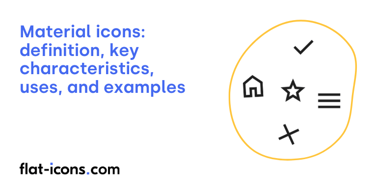
Material Icons are digital icons that form an open-source set designed by Google as part of their Material Design system, emphasizing simplicity and modern aesthetics for user interfaces.
The key characteristics of Material Icons are simplicity, geometric shapes, consistency, grid system, and stylistic variations.
Material Icons are typically used in web projects, Android applications, iOS applications, and physical signage systems.
Table of Contents
What are Material Icons?
Material Icons are a collection of icons developed by Google as part of its Material Design system. These icons are designed with the aim of being straightforward, contemporary, approachable, and sometimes possessing a unique stylistic touch. Each icon within the set is carefully crafted based on specific design principles to visually represent common user interface concepts in a simple and minimal manner, promoting clarity and ease of understanding within digital interfaces.
It’s important to note the distinction between the original “Material Icons” and their more recent successor, “Material Symbols.” Material Symbols were introduced in April 2022 and represent an evolution of the original set, leveraging variable font technology to offer increased versatility and customization options for designers and developers, forming an additional icon category.
The key difference lies in the underlying technology and capabilities. Material Symbols, built on variable fonts, allow for adjustments in weight and optical size, providing greater flexibility in adapting the icons to various design contexts. In contrast, the original “Material Icons” are now considered a legacy set and are no longer actively updated by Google, making Material Symbols the current and recommended choice for projects utilizing the Material Design system.
What are the key characteristics of Material Icons?

The key characteristics of Material Icons are listed below.
- Simplicity: Material Icons are designed with simplicity and a modern aesthetic, reducing each icon to its most essential form for effective communication.
- Geometric shapes: The icons utilize bold and geometric shapes to ensure clarity and readability, even when displayed at smaller sizes.
- Consistency: A consistent visual style is maintained throughout the icon set to provide a unified and coherent look across different icons.
- Grid system: The design of Material Icons is based on a grid system, typically a 24 x 24 density-independent pixel (dp) canvas, ensuring consistent proportions and alignment.
- Stylistic variations: Material Symbols and classic Material Icons offer multiple stylistic variations, including outlined, rounded, and sharp styles, providing flexibility in design implementation. Material Symbols also offer adjustable variable font axes for further customization.
Where are Material Icons typically used?

Material Icons are typically used as listed below.
- Web projects: Commonly integrated into websites for navigation, buttons, and general interface elements, providing a consistent and modern look.
- Android applications: Widely used as the standard icon set for Android app development, ensuring a cohesive visual language across the platform.
- iOS applications: Also utilized in iOS applications to maintain a consistent design aesthetic with Android or to leverage their comprehensive and recognizable library.
- Physical signage systems: Employed in physical spaces for wayfinding and informational purposes, such as at the Museum of Modern Art (MoMA), demonstrating their versatility beyond digital interfaces.
When should you use Material Icons?
You should use Material Icons within your user interface to visually represent functions, features, or distinct types of content, ultimately aiming to enhance clarity and recognition for your users. When selecting Material Icons, it’s recommended to prioritize universally recognized symbols to minimize any potential confusion.
Maintaining consistency in the application of Material Icons throughout your interface is crucial for creating a cohesive and intuitive user experience. Ensure that the chosen icons align with your overall brand identity and values. Lastly, for users with visual impairments, it is essential to provide descriptive alternative text (alt text) for all Material Icons to ensure accessibility for screen readers.
What are the pros and cons of using Material Icons?
The pros of using Material Icons are listed below.
- Extensive and versatile icon library: Offers a vast collection, especially with Material Symbols, and provides multiple styles (outlined, rounded, sharp).
- Optimized for performance and customization: Material Symbols leverage variable font technology for smaller file sizes and extensive customization, while the classic set is also performance-optimized.
- Easy integration across platforms and free to use: Material Icons are simple to incorporate into web, Android, and iOS projects and are licensed for free use and modification.
- Comprehensive support and design consistency: Includes thorough documentation, a supportive community, and ensures visual alignment with Material Design principles.
The cons of using Material Icons are listed below.
- Potentially generic style: The default minimalist style might not fit unique brand identities, and some users may find it too common.
- Dependency on external services: Relying on Google Fonts for some implementations introduces a dependency on an external service.
- Classic set is outdated: The original Material Icons set is no longer actively updated, which might limit its future relevance.
- Over-simplification: The emphasis on minimal forms could lead to icons that are too basic for certain contexts or fail to convey enough detail.
- Exclusion of third-party logos: The official sets do not include logos for other brands due to legal restrictions.
Read more icon articles
