Skeuomorphic icons are digital icons that mimic the appearance of real-world objects through realistic visual cues like textures and shadows. This design approach uses familiar physical objects to create a more intuitive and accessible experience within digital environments.
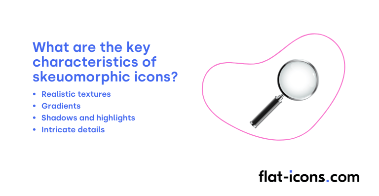
The key characteristics of skeuomorphic icons are realistic textures, gradients, shadows and highlights, and intricate details.
Skeuomorphic icons are typically used in early operating systems, utility applications, media applications, system-level icons with established recognition, and e-commerce (representing physical products).
Table of Contents
What are skeuomorphic icons?
Skeuomorphic icons are graphical user interface elements designed to visually resemble real-world, tangible objects. The term “skeuomorphism” comes from the Greek words “skeuos,” meaning vessel or tool, and “morph,” meaning shape.
The main reason for using skeuomorphic icons, a defining characteristic of this icon style, is to tap into the user’s existing knowledge of physical objects, making it easier for them to understand their digital counterparts and the actions they represent.
What are the key characteristics of skeuomorphic icons?

The key characteristics of skeuomorphic icons are listed below.
- Realistic textures: These icons often incorporate textures that mimic real-world materials, such as wood grain, leather, or paper.
- Gradients: The use of gradients is a key characteristic, simulating how light interacts with three-dimensional objects to create depth and volume.
- Shadows and highlights: Strategic application of shadows and highlights enhances the three-dimensional effect, mimicking the interplay of light and shadow on physical objects.
- Intricate details: These icons often include fine details that mirror the nuances of their physical counterparts, such as stitching or reflections, contributing to the overall realism.
Where are skeuomorphic icons typically used?
Skeuomorphic icons are typically used as listed below.
- Early operating systems: Predominantly used in the early days of operating systems (like early versions of macOS and Windows) to make digital interfaces feel familiar to users accustomed to physical objects.
- Utility applications: Often employed in applications that mimic real-world tools, such as calculator apps with buttons that resemble physical calculators or notes apps that look like paper notepads.
- Media applications: Found in applications dealing with media, such as music player interfaces that resemble physical stereos or photo editing apps that mimic darkroom tools.
- System-level icons with established recognition: Retained in some system-level icons (like the recycle bin or folder icons) due to their long-standing recognition and intuitive association with their function.
- E-commerce (representing physical products): Sometimes used in e-commerce to provide a more tactile and realistic representation of physical products, helping users visualize them.
When should you use skeuomorphic icons?
You should use skeuomorphic icons particularly when introducing new users to complex interfaces. By leveraging familiar metaphors from the real world, these icons can significantly reduce the learning curve associated with navigating unfamiliar digital environments, making the interface more intuitive for beginners.
Skeuomorphism can also be effectively employed in niche applications that closely mirror real-world tools or activities, enhancing the sense of familiarity and ease of use for users already accustomed to those physical counterparts.
Furthermore, the use of skeuomorphism holds the potential to evoke nostalgia and establish emotional connections with users by referencing familiar objects and designs from the past.
What are the pros and cons of using skeuomorphic icons?
The pros of using skeuomorphic icons are listed below.
- Improved intuitiveness and usability for some users: Skeuomorphic icons can be easier for new or less tech-savvy individuals to understand due to their resemblance to real-world objects.
- Increased engagement and familiarity: Their visual appeal can evoke emotional connections and nostalgia, potentially improving the user experience in specific contexts.
- Leverages familiar metaphors: This can make the design process more intuitive for some designers.
The cons of using skeuomorphic icons are listed below.
- Potential for clutter and usability issues: Overly detailed skeuomorphic designs can lead to visual clutter and potentially mislead users.
- Risk of appearing outdated and hindering performance: This style can sometimes feel dated, and the detailed graphics may negatively impact app performance.
- Accessibility challenges: Intricate details and low contrast can make these icons difficult to perceive for visually impaired users.
- Consistency issues across platforms: Maintaining a consistent skeuomorphic style across different operating systems and devices can be challenging.
What are some examples of skeuomorphic icons?
Some examples of skeuomorphic icons are listed below.
- A notepad icon: Designed to look like a real paper notepad, possibly with lines, a spiral binding, and a slightly textured surface.
- A calendar icon: Resembling a physical desk calendar, perhaps showing rings, torn-off pages, and a specific date highlighted.
- A trash can icon: Depicted as a realistic metal or plastic wastebasket, often with a lid and sometimes with crumpled paper visible inside.
- A calculator icon: Designed to look like a handheld calculator, complete with buttons that appear to be raised and have a glossy finish.
- A camera icon: Mimicking the appearance of a real-world camera, with details like a lens, flash, and textured grip.
- An envelope icon: Resembling a physical paper envelope, possibly with a seal or a slightly wrinkled texture.
- A bookshelf icon: Designed to look like a wooden bookshelf filled with books of varying sizes and colors, often with visible wood grain.
- A leather-bound address book icon: Appearing as a physical address book with a textured leather cover, possibly with stitching or embossed details.
- A CD or DVD icon: Designed to look like a physical compact disc or digital versatile disc, often showing a reflective surface and labeling.
- A sewing machine icon: Resembling a vintage or modern sewing machine with visible parts like the needle, foot pedal, and fabric.
How do you create skeuomorphic icons?

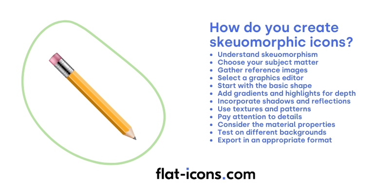
You create skeuomorphic icons by following the step-by-step guide below.
- Understand skeuomorphism: Skeuomorphic icons are designed to mimic real-world objects in their appearance. They often incorporate textures, gradients, shadows, and highlights to create a sense of depth and realism, making them look tangible.
- Choose your subject matter: Select a real-world object that you want to represent as an icon. Think about its key visual characteristics, such as its shape, texture, and material.
- Gather reference images: Find high-quality reference images of the object you’ve chosen. Pay close attention to how light interacts with its surface, the textures present, and the subtle details that make it recognizable.
- Select a graphics editor: You can create skeuomorphic icons using both raster-based software like Adobe Photoshop or vector-based software like Adobe Illustrator (though it’s often more challenging to achieve a highly realistic look in vector).
- Start with the basic shape: Begin by creating the fundamental shape of your object in your chosen software. Use basic shapes and tools to establish the overall form and proportions.
- Add gradients and highlights for depth: Use gradients to create a sense of volume and curvature. Apply highlights to simulate how light would reflect off the object’s surface, adding a three-dimensional feel.
- Incorporate shadows and reflections: Add shadows to ground your icon and create separation between different elements. Use reflections to simulate shiny or polished surfaces, enhancing the realism.
- Use textures and patterns: Apply textures to mimic the surface of your chosen object. This could involve using built-in textures, creating your own, or importing texture images. Patterns can also be used to represent specific materials or details.
- Pay attention to details: Skeuomorphism relies heavily on small, realistic details. Carefully observe your reference images and try to replicate subtle features like seams, buttons, or surface imperfections.
- Consider the material properties: Think about the material your object is made of (e.g., metal, wood, glass, leather) and try to convey its specific characteristics through your use of color, texture, and highlights. For example, metal might have sharp highlights and reflections, while wood might have a subtle grain texture.
- Test on different backgrounds: Once you’ve created your skeuomorphic icon, test how it looks on various backgrounds, both light and dark. Adjust your shadows and highlights as needed to ensure it remains visible and appealing.
- Export in an appropriate format: Depending on your needs, you can export your skeuomorphic icon in a raster format like PNG (which supports transparency and is good for detailed, pixel-based graphics) or, if you used vector software, potentially in SVG (though highly detailed skeuomorphic icons might be complex as vectors). Choose the format that best suits the intended use of your icon.
Read more icon articles
