Additional icon categorizations refer to categories of icons that are commonly used but don’t typically belong to icon styles, icon types, icon formats. The 7 additional icon categorizations are material icons, resemblance icons, clarifying icons, arbitrary icons, conflicting icons, colored icons, and icon sets.
Table of Contents
1. Material icons
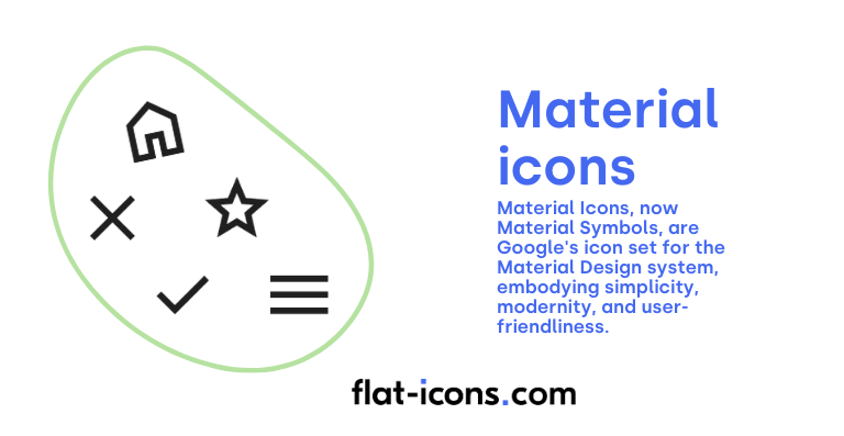
Material Icons, now Material Symbols, are Google’s icon set for the Material Design system, embodying simplicity, modernity, and user-friendliness. These icons are intentionally designed to represent common concepts encountered within user interfaces, employing minimalist forms to ensure clarity and ease of recognition.
A key characteristic of Material Icons is their optimization for clarity across a wide range of sizes and their inherent adaptability to various platforms and screen resolutions, ensuring a consistent visual experience regardless of the device.
To facilitate their use, Google provides this extensive library in multiple formats, including SVG for scalable vector graphics, PNG for raster images, and even as a font for easy integration into web and application development.
The primary purpose of this initiative is to streamline design workflows for developers and designers, while simultaneously promoting a unified and intuitive user experience across all applications that adhere to the principles of Material Design.
2. Resemblance icons
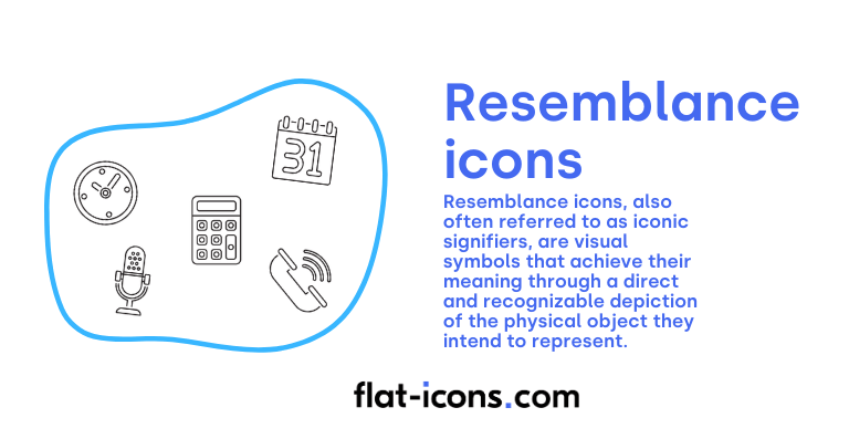
Resemblance icons, also often referred to as iconic signifiers, are visual symbols that achieve their meaning through a direct and recognizable depiction of the physical object they intend to represent. The fundamental goal of these icons is to establish an immediate visual connection in the user’s mind to a tangible counterpart in the real world.
Familiar examples readily illustrate this concept, such as the ubiquitous magnifying glass icon signifying the action of search, the shopping cart icon universally understood to represent a user’s basket or items for purchase, an envelope icon clearly indicating email or messaging, and a house icon serving as a straightforward representation of a homepage or main navigation point.
The effectiveness of resemblance icons lies in their intuitive nature, leveraging existing user knowledge of real-world objects to quickly convey functionality within a digital interface.
3. Clarifying icons
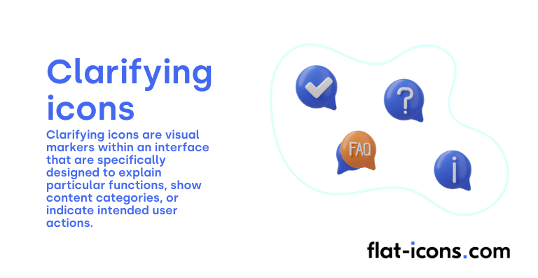
Clarifying icons are visual markers within an interface that are specifically designed to explain particular functions, show content categories, or indicate intended user actions.
Unlike icons that primarily represent objects or trigger direct interactions, clarifying icons often function as supplementary visual aids that enhance accompanying text to foster improved user comprehension.
A common and effective example of a clarifying icon is the eye icon frequently found in password fields, which provides a clear visual cue to toggle the visibility of the entered text, allowing users to confirm their input.
By enhancing textual information with relevant visual cues, clarifying icons contribute to a more intuitive navigation experience and increase the overall flexibility and usability of the interface.
4. Arbitrary icons
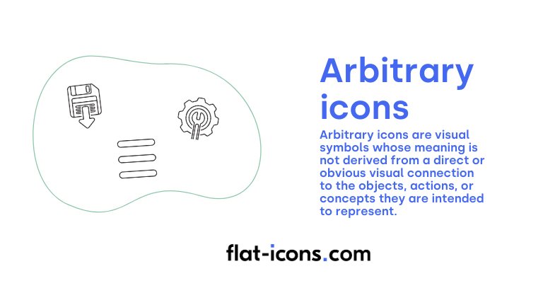
Arbitrary icons are visual symbols whose meaning is not derived from a direct or obvious visual connection to the objects, actions, or concepts they are intended to represent. Instead, their recognizability and understanding are entirely based on established convention, repeated use over time, or learned habit within a specific digital or cultural context. The relationship between the icon’s visual form and its intended meaning is, therefore, arbitrary and must be learned through exposure and cultural understanding.
Classic examples of arbitrary icons include the question mark symbol, which is universally understood to represent “help” or access to assistance, the floppy disk icon, which, despite the obsolescence of the physical object, still conventionally signifies the action of “save,” and the power button symbol, whose abstract design has become globally recognized as the indicator for turning a device on or off.
5. Conflicting icons
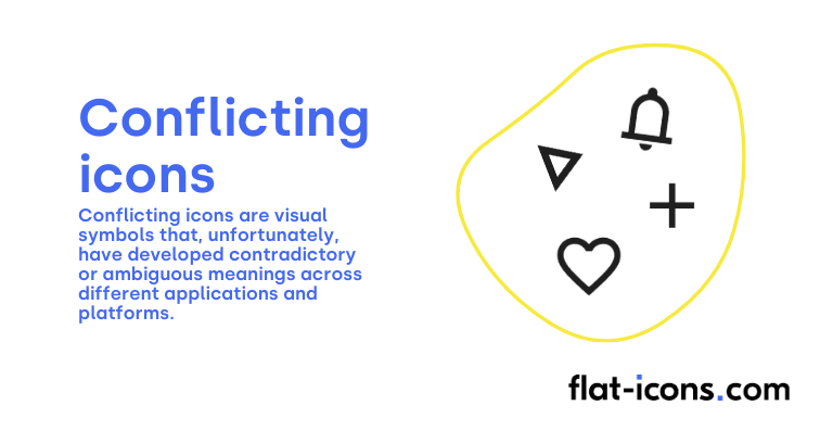
Conflicting icons are visual symbols that, unfortunately, have developed contradictory or ambiguous meanings across different applications and platforms. This lack of standardization in their interpretation can lead to significant confusion for users and ultimately diminishes the overall user experience.
The ambiguity arises when the same visual symbol is employed to represent different functions or concepts in various contexts, making it difficult for users to predict the outcome of interacting with such an icon.
Common examples of conflicting icons include the heart symbol, which can variously indicate favorites, likes, general popularity, or even health or lives in certain gaming contexts, and the star symbol, which might signify favorites, ratings, featured items, or important content depending on the application. This lack of a universally agreed-upon meaning makes these particular icons potentially problematic in interface design.
6. Colored icons
Colored icons are a vague category that refers to icons where color plays a pivotal role in influencing how users perceive their meaning and the brand that they represent.
The field of color psychology delves into the intricate ways in which different hues can affect human emotion, cognition, and behavior. Colors are deeply linked to specific emotions, cultural associations, and values, allowing brands to strategically shape their visual identity and subtly influence consumer responses. For instance, the color red is frequently associated with conveying a sense of power, energy, and urgency, while the color blue often suggests feelings of serenity, stability, and trustworthiness.
By carefully selecting the colors used in their colored icons, brands can effectively communicate their intended message and reinforce their desired brand image in the minds of their users.
7. Icon sets
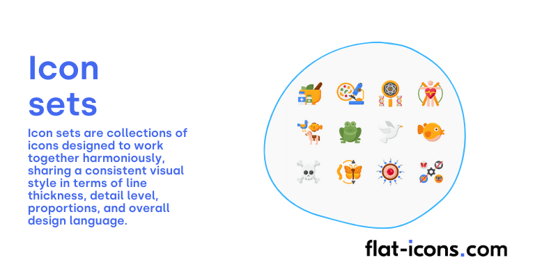
Icon sets are collections of icons designed to work together harmoniously, sharing a consistent visual style in terms of line thickness, detail level, proportions, and overall design language.
Maintaining a high degree of consistency across all the individual icons within icon sets is absolutely crucial for achieving a polished and professional visual appearance in any user interface.
To achieve this, it is essential to establish a clear and well-defined visual language for the entire icon set, specifying guidelines for elements such as line weight, the rounding of corners, the use of fills or outlines, and any other recurring design elements that contribute to the overall style and unity of the icon collection.
Read more icon articles
