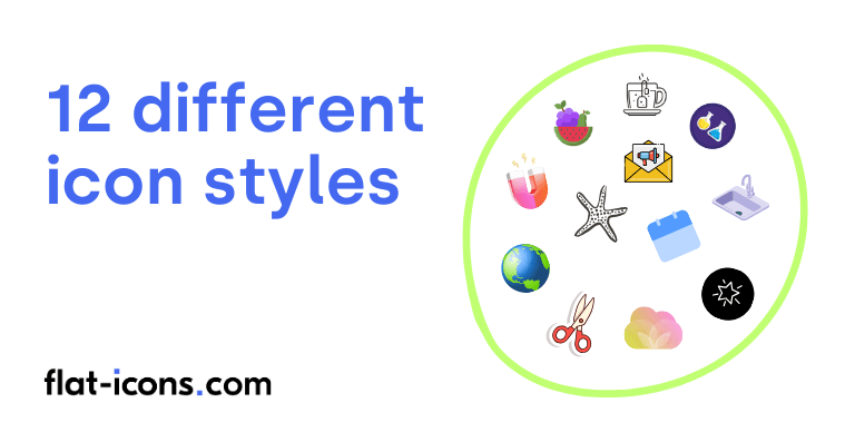
Icon styles refer to the visual treatment and aesthetic appearance icons. The 12 different icon styles are flat icons, animated icons, 3d icons, rounded icons, line (outlined) icons, isometric icons, hand drawn (doodle) icons, duotone icons, skeuomorphic icons, gradient icons, sticker icons, filled icons.
Table of Contents
1. Flat icons
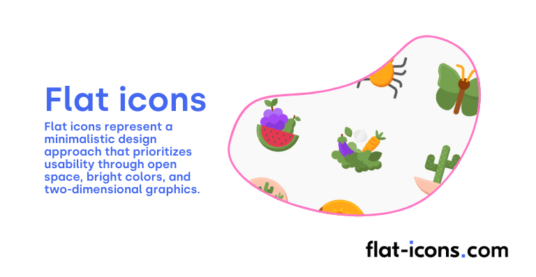
Flat icons represent a minimalistic design approach that prioritizes usability through open space, bright colors, and two-dimensional graphics. They are characterized by their 2D visual detailing, clean lines, basic geometric shapes, and the use of bold, solid colors.
A defining feature of flat icons is the absence of three-dimensional effects such as gradients, shadows, and textures, contributing to their crisp and modern appearance. This simplicity offers several benefits, including clarity, a contemporary aesthetic, and smaller file sizes, which contribute to faster loading times.
The rise of flat design reflects a broader trend towards simplicity and efficiency in digital interfaces, driven by a focus on user experience. Flat icons are widely used in mobile applications and websites that aim for a clean and efficient user experience, allowing for essential functions and actions to be conveyed straightforwardly.
2. Animated icons
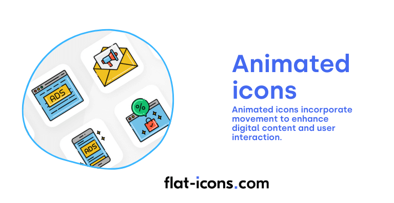
Animated icons incorporate movement to enhance digital content and user interaction. Their dynamic nature can bring abstract icons to life, making it easier for users to understand complex applications or functions within an interface.
These icons are available in various file formats such as AEP (Adobe After Effects Project), JSON (JavaScript Object Notation), SVG (Scalable Vector Graphics), GIF (Graphics Interchange Format), and MP4 (MPEG-4 Part 14).
The primary benefits of animated icons include improved user engagement and a clearer communication of abstract concepts, ultimately leading to an enhanced user experience. They are commonly used in web projects, app interfaces, and marketing materials to add a layer of interactivity and expressiveness.
3. 3D icons
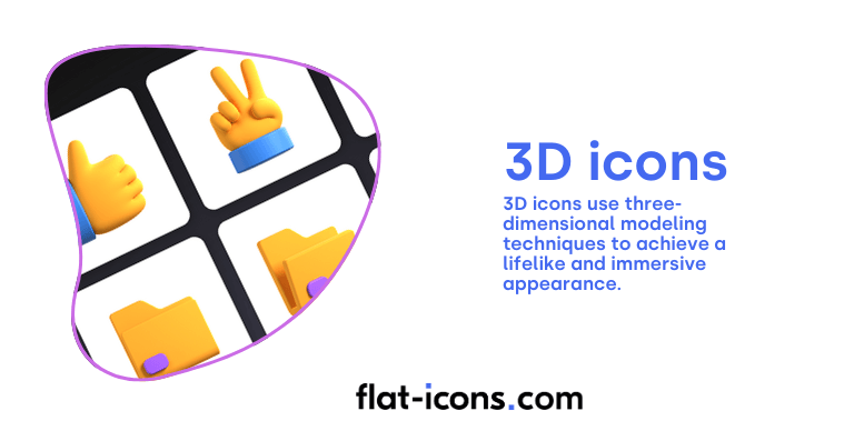
3D icons use three-dimensional modeling techniques to achieve a lifelike and immersive appearance. They possess depth, height, and width, often incorporating textures, shadows, and highlights to simulate realism.
The process of creating 3D icons involves rendering, which can be done in real-time for interactive graphics and gaming, or through pre-rendering for applications where image speed is not a priority, such as animation works.
The use of 3D icons offers the advantage of enhanced visual appeal and the ability to represent complex objects with a high degree of realism. However, this visual fidelity can sometimes come with trade-offs in terms of file size and rendering complexity.
3D icons are extensively used in gaming, product visualization for marketing purposes, and in contexts where a high degree of realism and visual engagement is desired.
4. Rounded icons
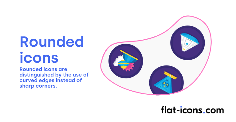
Rounded icons are distinguished by the use of curved edges instead of sharp corners. This design choice results in a softer and more inviting visual appearance.
The use of rounded shapes in user interfaces is often associated with a more friendly and approachable user experience, as humans are instinctively drawn to curved forms, which can evoke feelings of safety and comfort. Rounded icons can also be perceived as being easier on the eyes and less visually jarring than designs with sharp corners.
This style is particularly well-suited for brands that utilize curved logos or circular elements in their visual identity, creating a cohesive and harmonious aesthetic.
5. Line (outlined) icons
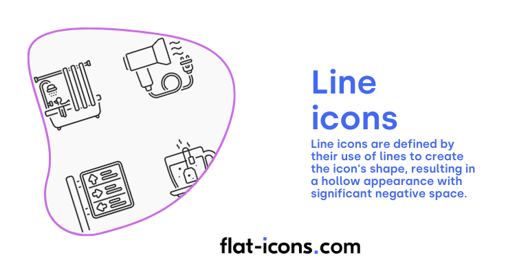
Line icons, also known as outlined, stroked, or lined icons, are defined by their use of lines to create the icon’s shape, resulting in a hollow appearance with significant negative space. This style is characterized by its minimalism and elegance, offering a clean and uncluttered aesthetic.
A major advantage of line icons is their scalability, as they are typically created as vector graphics, allowing them to be resized without any loss of quality. They are often favored for sophisticated professional interfaces and can be effectively used to highlight active elements within a user interface.
However, the effectiveness of outlined icons can depend on the clarity of their characteristic cues – the elements that make them easily identifiable and the surrounding context. If these cues are subtle or the inner spacing is too narrow, they might require more cognitive effort for users to recognize compared to filled icons.
6. Isometric icons
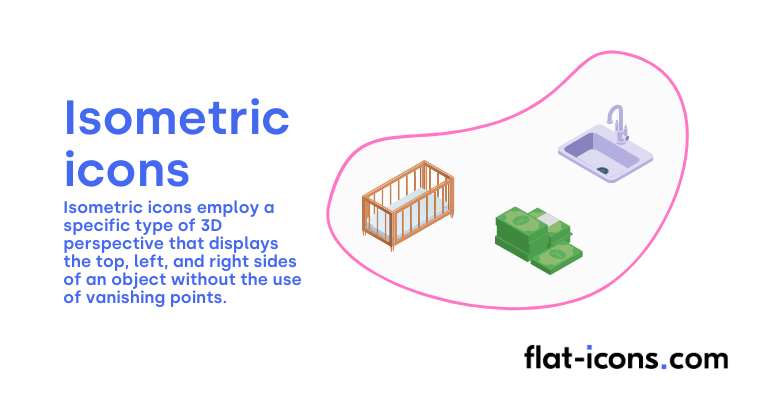
Isometric icons employ a specific type of 3D perspective that displays the top, left, and right sides of an object without the use of vanishing points. In this visual representation, the angles between the x, y, and z axes are all equal at 120°, and there is no foreshortening, meaning all dimensions are drawn at full scale, maintaining their proportions. This technique creates an illusion of depth and space on a two-dimensional plane.
Isometric projection finds applications in various fields, including industrial design for visualizing layouts and representing parts, architecture for illustrating building complexes, video games for creating immersive environments, and graphic design for generating scaled representations of flat surfaces.
Isometric icons offer a unique way to depict three-dimensional objects in a two-dimensional space while preserving a consistent sense of scale and proportion.
7. Hand drawn (doodle) icons
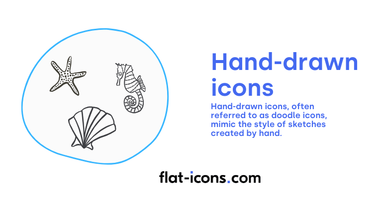
Hand-drawn icons, often referred to as doodle icons, mimic the style of sketches created by hand, frequently featuring imperfections and a more informal, personal feel.
Key characteristics of this style include simplicity in shapes and forms, a degree of abstraction, an artisanal flavor, and often intentional asymmetry and imbalance. Visual texture, achieved through techniques like shading, stippling, and varying line weights, is also common.
The use of hand-drawn icons can convey a sense of authenticity, creativity, and approachability, helping brands to stand out and connect with their audience on a more personal level. While this style adds a human touch to digital interfaces, hand-drawn icons may not be pixel-perfect and can sometimes be more challenging to manipulate digitally compared to vector-based icons.
8. Duotone icons
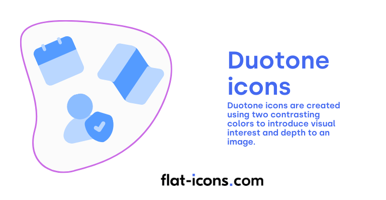
Duotone icons are created using two contrasting colors to introduce visual interest and depth to an image. This technique typically involves starting with a grayscale version of the icon and then applying two selected colors across the different tonal ranges.
Often, a darker tone is used for the base color, while a lighter or contrasting color is applied to highlight details. The duotone effect can create a striking visual impact, enhance the mood of the icon, and contribute to a modern web aesthetic.
Duotone icons are versatile and can be effectively used in various design contexts, including branding, to create a memorable and consistent visual identity.
9. Skeuomorphic icons
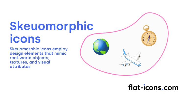
Skeuomorphic icons employ design elements that mimic real-world objects, textures, and visual attributes to make digital interfaces feel familiar and intuitive. These icons often incorporate depth, shadows, gradients, and realistic details to create a three-dimensional and tactile appearance.
The goal of skeuomorphism is to leverage users’ existing knowledge of physical objects to help them understand how to interact with their digital counterparts. For instance, a trash can icon visually resembles a physical trash bin, suggesting its function of deleting items. While skeuomorphism was prevalent in early digital interfaces, there has been a significant shift towards flatter designs in recent years.
However, skeuomorphic icons can still be valuable in specific contexts for creating visual affordances (cues that suggest how users can interact with an element) and for onboarding new users by relating digital functions to familiar real-world objects. A potential drawback of skeuomorphism is that it can sometimes lead to cluttered or dated-looking interfaces due to the inclusion of purely decorative elements.
10. Gradient icons
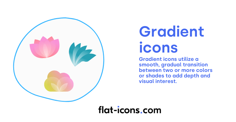
Gradient icons utilize a smooth, gradual transition between two or more colors or shades to add depth and visual interest. These transitions can occur in various forms, including linear (straight line), radial (outward from a center point), angular (around a central point), and diamond (shaped like a diamond) gradients.
Gradients can enhance the aesthetic appeal of icons, draw viewers’ attention to specific elements, and create a sense of volume or dimension. They are commonly used in logos, backgrounds, user interface elements like buttons, and to create effects such as highlights and shadows.
Gradient icons offer a versatile way to enrich the design with subtle or bold color transitions, making them more visually dynamic than monochromatic fills.
11. Sticker icons
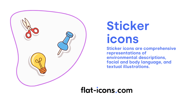
Sticker icons are typically larger than standard emoticons or emoji and are often presented as thematic sets within messaging applications and social networking services. They can be comprehensive representations of various elements, including environmental descriptions, facial and body language, and textual illustrations.
Stickers can be textual, pictorial, or a combination of both, and can be static PNG images or animated GIFs. A key feature of sticker icons is the high level of personalization they offer to users.
They serve as a more expressive form of visual communication in digital messaging compared to smaller emoticons or emoji, allowing users to convey a wider range of emotions and ideas.
12. Filled icons
Filled icons are graphical symbols that are solid in color, characterized by simple, solid shapes. They can be easily scaled and customized with different colors and shadow effects.
Due to their solid form, filled icons tend to stand out well, even at smaller sizes, making them particularly suitable for mobile interfaces or applications where space is limited.
Research suggests that filled icons are generally faster to recognize than outline icons, especially when representing physical objects that users are accustomed to seeing in solid form. They provide clear visual cues for interactive elements within a user interface. However, at larger sizes, filled icons might lack the visual interest of more detailed styles.
What are the differences between icon styles and icon types?
Icon styles refer to the visual appearance of icons while icon types refer to the functionality of icons. The differences between icon styles and icon types are listed below.
- Focus: Icon style is how the icon looks, while icon type is what the icon represents or does.
- Examples: Examples of icon styles include flat, animated, 3D, rounded, and outlined. Examples of icon types include glyph, app and favicons.
- Primary concern: Icon style’s primary concern is visual design and user perception, while icon type’s primary concern is meaning, function, and user understanding.
What are the differences between icon styles and icon formats?
Icon styles refer to the visual look of icons, while icon formats refer to the file structure and technical properties of icons. The differences between icon styles and icon formats are listed below.
- Focus: Icon style is how the icon looks, while icon format is how the icon is stored, displayed, and scaled.
- Examples: Examples of icon styles include flat, animated, 3D, rounded, and outlined. Examples of icon formats include SVG, PNG, GIF, and MP4.
- Primary concern: Icon style’s primary concern is visual design and user perception, while icon format’s primary concern is how the icon file is structured and handled by software and browsers.
Read more icon articles
